The team at GOOP Digital specialises in mobile website design in Geelong.
Ever wondered how your app or web page should be structured?
Most people use their mobile phones for personal online tasks, and data shows that the majority of Google searches and website visits are done on mobile devices.
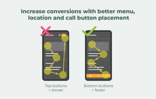
On mobile, the thumb dominates user behaviour. According to Stephen Hoober’s research, 75% of users use their thumbs to touch their mobile screens, and mobile users are more likely to scroll to or scan towards the bottom of a page. This is why placing primary buttons at the bottom of the screen can increase conversion rates by 6%.
When deciding where to place the menu, call button, and location button, it’s important to consider the Gutenberg Principle, which suggests that reading gravity flows downward. Users typically start by scanning the content from the top of the screen towards the bottom, and then look for a way to get in touch with the business or explore the website further.
Buttons at the bottom are optimal as it allows users to see and reach for it quickly with their thumbs.
For more information on digital marketing and website development and design in Geelong, contact us today.