Responsive websites now the standard in Geelong and beyond
This month, our online marketing topic has been centred on Google Analytics (let’s refer to it as GA from hereon in, OK?), how to navigate it and how to use the data to make informed decisions about your business’s online marketing plans. Adding GA to sites we build is standard practice.
It was a good month to focus on this topic as Google has been playing around with mobile search results and a crack-down on non-responsive websites has become apparent! In fact, we are concerned that non-responsive websites are beginning to drop out of mobile search results, so it’s important to check your website’s mobile traffic in GA.
Now, let’s take a step back, because we realise those two sentences above might not mean too much to non-web geeks – and fair enough. So let us explain a couple of things:
- Mobile search results are the results you get on your mobile phone after searching for something in Google. You can get different results for the same search on different devices, i.e. search results on a desktop computer can vary from mobile search results. This is due to many factors, including your location. For example, if you’re out and about on your mobile phone and you have your location services turned on, and you search for a product or service, you’re most likely to get results closest to your actual location. Whereas if you’re searching from a desktop computer, you will get a wider variety of results, because Google is smart enough to realise you’re probably not on the go with your desktop, so you can afford to research more options in a wider geographic range.
- Responsive websites automatically adjust to the size of the screen the user is viewing from. These sites are designed to work optimally on mobile phones, tablets and desktop computers. If your website is non-responsive, it can still be seen on all devices, but users on mobiles and tablets would need to zoom in and scroll across. Responsive websites re-adjust themselves so that the content fits within the width of the screen you are using, so you only need to scroll up and down, not across.
It all started when Google began attaching mobile-friendly and non-mobile friendly messages to websites appearing in mobile search results. At first, this appeared to be a feature designed simply to help the user determine which sites they wanted to visit based on user-friendliness. It didn’t appear to have any bearing on whether your site actually appeared in the mobile search results list. Now those messages are gone and the research we’ve done suggests that non-responsive websites will most likely be penalised in mobile search results. In short, the labels are gone and the real consequences have arrived! Hence, we are concerned non-responsive websites are beginning to drop out of mobile search results. The checks we’ve done certainly point to this being the case.
Let’s remember that Google will NEVER release it’s actual algorithms – the search formulas which determine what you see in its search results lists – but it does allude to algorithm updates and what these might mean. So nothing is ever written in stone, because it’s not the stone age anymore and things are constantly evolving.
Now, this is where your GA data comes in. You should check it and use the data to make an informed decision about your website. So, go and look at your mobile traffic on GA NOW! What percentage of traffic is viewing your website on a mobile device (phone/tablet)? And how many users does this equate to? This number is how many potential clients might NOT be seeing your website IF it’s not responsive!
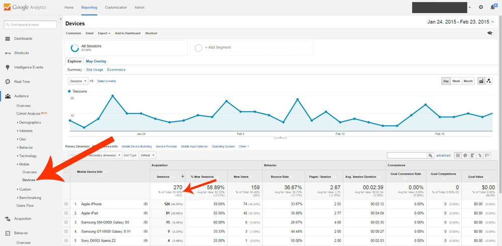
Sign into GA and click through the left-hand menu: Audience > Mobile > Devices. This option will show the devices users are viewing your site from, with the percentage and number of mobile and tablet devices this equates to. If your mobile traffic is 30% or above, we consider it a no-brainer to prioritise upgrading your website to a responsive design. Even if it is less than 30%, we still recommend considering an upgrade in the near future, but 30% and above is critical.
The screenshot of a site’s GA below shows more than 60% mobile traffic, which equates to 270 users in the last 30 days.
Whether you’re an existing GOOP client or a new client, please contact us for more information specific to your business or current website. We build responsive websites from our office in Geelong, and will be happy to help your website perform better. Don’t forget that we service clients Australia-wide, too.